Insight from the Inside
Insight from the Inside: Alto Grotesk
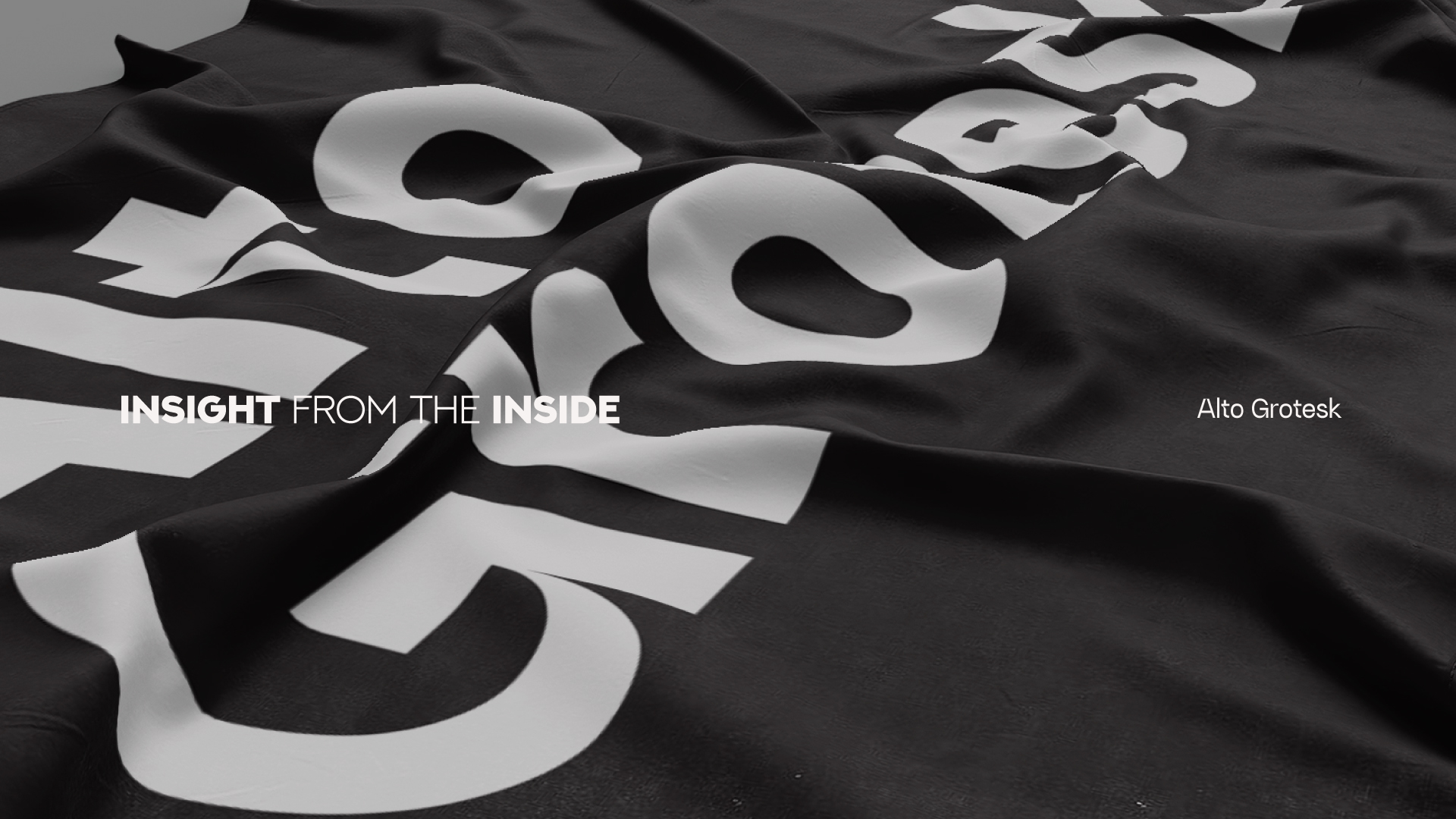
Photo by Ovan Mustofa & Reza Zulmi Yustisia
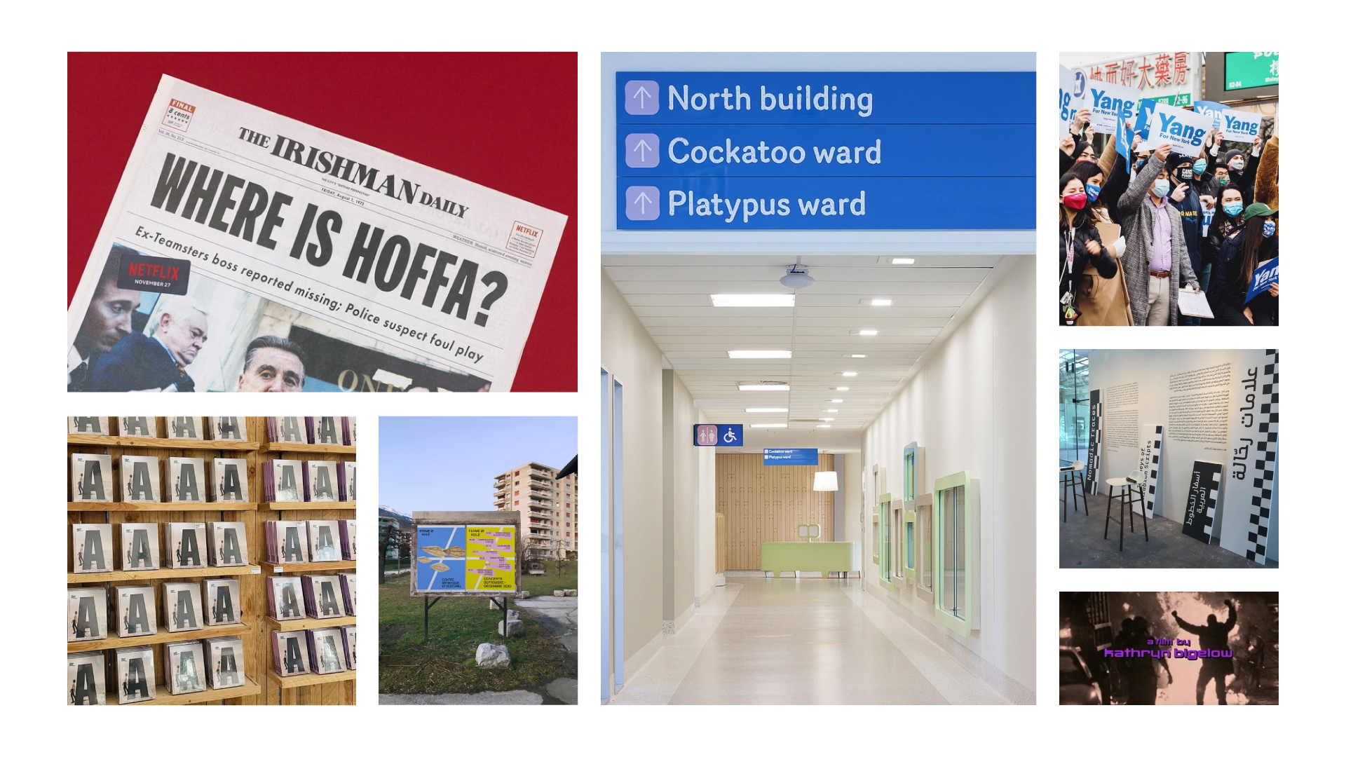
Fonts play a significant role in our daily life today. Almost everywhere we could find it: the morning newspaper that you just read, signage of direction on the street, your smartphone with loads of social media apps in it, fonts have become an essential tool for our daily communications. It’s a matter of type, the type that matters.
Our creative team is on the voyage of creating a typeface that represents Hi Jack Sandals. The journey to make the ease of communication, with an innovative solution.
We are surrounded by multiple languages, dialects, and scripts that we can witness in society. We explore the vernacular in its rich typographic landscape and design a new font representing its translocal culture and from the flow of Hi Jack Sandals straps.
Almost everywhere we could find it: the morning newspaper that you just read, signage of direction on the street, your smartphone with loads of social media apps in it, fonts have become an essential tool for our
daily communications.
Design Process
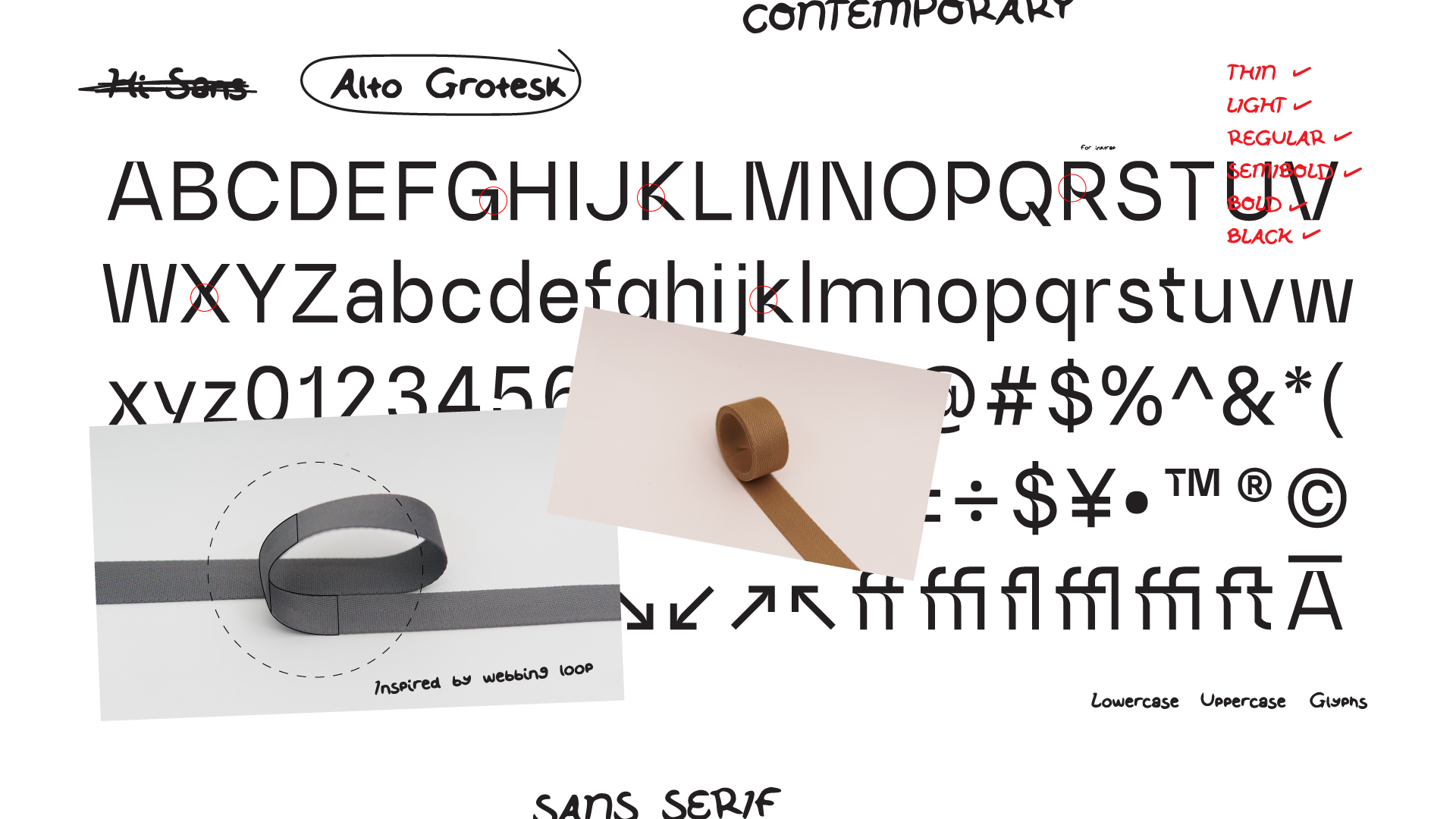
Harlan Gunawan as our Graphic Designer patiently crafts alto Grotesk. It took weeks to design it with careful details for the kerning and weight of the font. Kerning is the process of adjusting the space between characters in a proportional font, usually to achieve a visually pleasing result. Kerning adjusts the space between individual letterforms. In contrast, tracking (letter-spacing) adjusts spacing uniformly over a range of characters. Alto Grotesk is processed and designed through FontLab software. FontLab is a modern, professional font editor crafted for type designers and font geeks.
Alto Grotesk 1.0
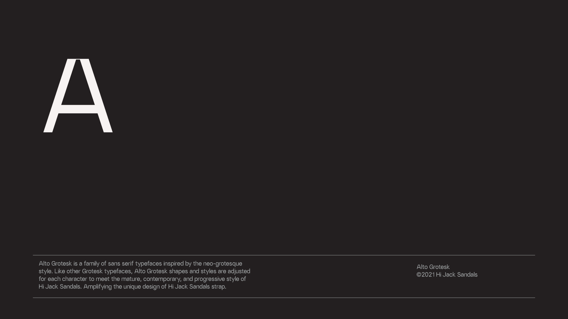
Alto Grotesk is a sans serif typeface inspired by the neo-grotesque style. Alto Grotesk is available in thin to black and oblique typefaces. Like other Grotesk typefaces, Alto Grotesk shapes and styles are adjusted for each character to meet the mature, contemporary, and progressive style of Hi Jack Sandals. Amplifying the unique design of the Hi Jack Sandals strap.
Alto Grotesk consists of 1200 glyphs, 12 styles, 1 variable font, and OpenType features. Constant experimentation in creativity and design.
Why Alto & Why Typeface?
Alto has been our primary product since 2017. The distinguished silhouette has been our classical piece, our Moonlight Sonata, a living witness to our journey in creating sandals. Alto has become a staple in Hi Jack Sandals DNA. Thus, this becomes the main name of our typeface.
Constant experimentation with visuals made us realize that we needed one established font to represent Hi Jack Sandals itself through the years and future time ahead. As time and the brand progress, one primary typeface is considered a mature way to communicate to society.
Implementation?
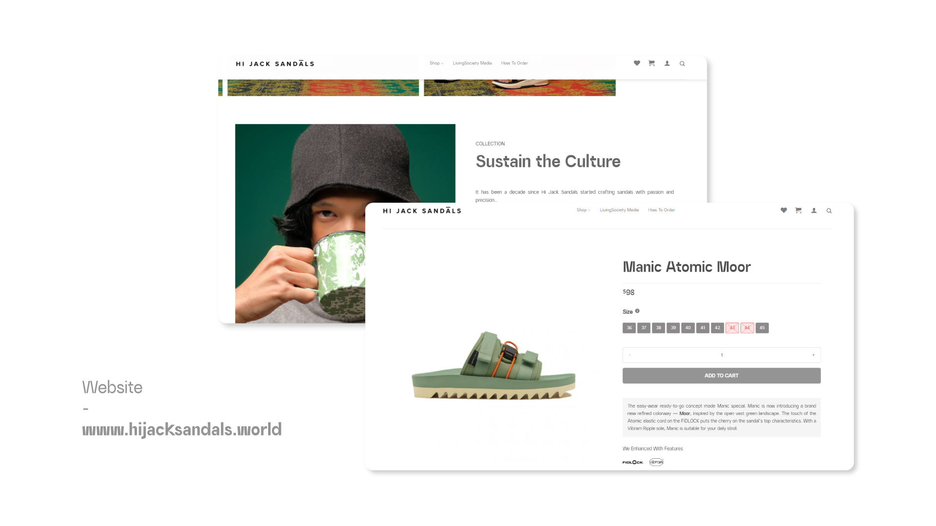
Alto Grotesk is officially used as the primary typeface on our global website www.hijacksandals.world. In line with the Sustain The Culture campaign, Alto Grotesk is also a part of our effort in creating ease of communication for society through typeface.
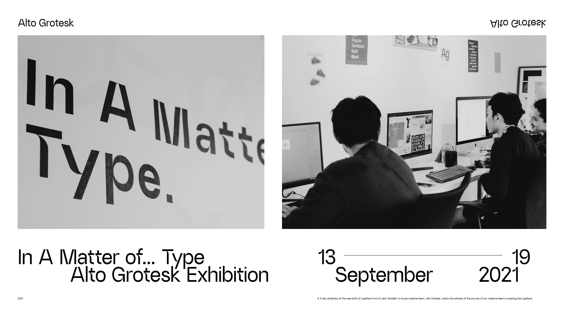
In A Matter of… Type – Alto Grotesk Exhibition
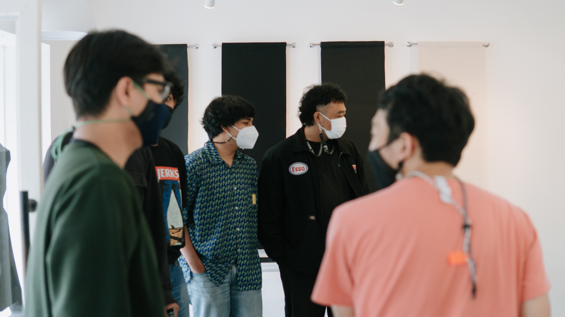
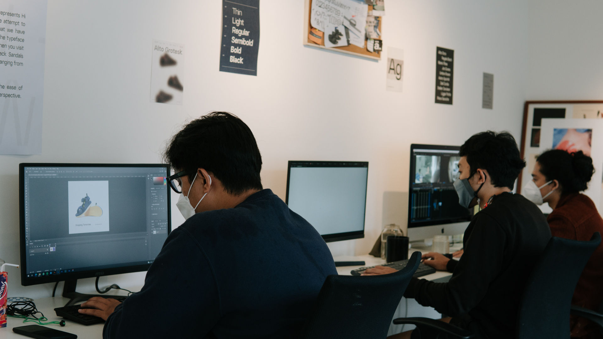
A 5-day exhibition of the new birth of typeface from Hi Jack Sandals’ in-house creative team, Alto Grotesk, marks the witness of the journey of our creative team in creating the typeface. We exhibit how the Alto Grotesk is made by having our creative team relocate their workspace in the front space of our store and share their insights into the typeface. The exhibition takes place in front of our store in Dahlia 1A, Bandung, with a workspace atmosphere to showcase the day-to-day activities of our creative team.
Hi Jack Sandals creative team is Galih Suryana Putra and Harlan Gunawan as Graphic Designers, Reza Zulmi Yustisia and Ovan Mustofa as Visual Producers. Tomy Herseta leads the team as Art Director and is supported by Muhammad Azka Muharam for crafting writing materials. Alto Grotesk became the first project created by this team.
We are surrounded by multiple languages, dialects, and scripts that we can witness in society. We explore the vernacular in its rich typographic landscape and design a new font representing its translocal culture and from the flow of Hi Jack Sandals straps.
Constant experimentation with visuals made us realize that we needed one established font to represent Hi Jack Sandals itself through the years and future time ahead. As time and the brand progress, one primary typeface is considered a mature way to communicate to society.
As Harlan Gunawan stated, “We are interested in the vernacular type from our surroundings, such as fonts in society. It somehow created a sense of uniqueness and its characters from the culture”.
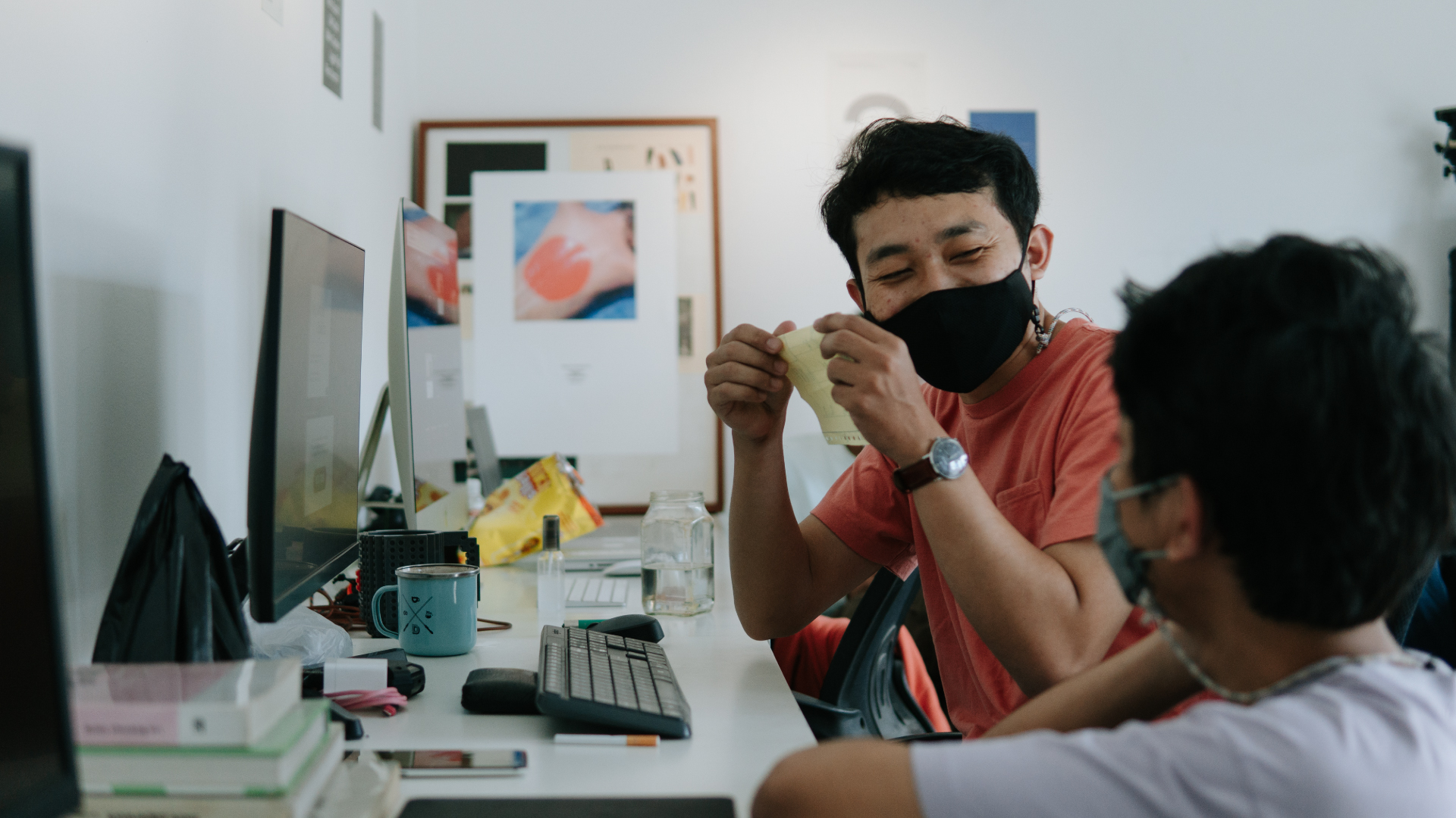
With spinning sessions from our team to create a lively ambiance for the exhibition. We also created Instagram stories to engage with people presenting Q&A sessions with all of our creative team. This marks an effort for us to sustain the culture and for the future of Hi Jack Sandals.


What’s Next for Alto Grotesk?
This is just the beginning of a long journey ahead and endless possibilities for Alto Grotesk. Our creative team will continually conduct research and development to expand the typeface into many types for the future.